Culture&

A new name and identity for an inspirational charity

View
Praline, graphic Design, Branding, Visual Identity, Website Design, Digital Communication, Culture&
Client:   Culture& Year:   2022 Location:   London, UK Services:   Brand Strategy, Branding, Web Design

Culture& is an independent arts and education charity who works in partnership with arts and heritage institutions and artists to develop programmes that promote diversity in the workforce and expand audiences. Celebrating Culture&’s key values of diversity, collaboration, curation, education and innovation, we designed an identity that shows its heritage and wealth of experience to inspire a new audience.

We saw that the brand needed to focus on their long tradition in addressing diversity. We wanted to represent this in a bold messaging and look & feel. The new name (previously Cultural Co-Operation) expresses their mission to new audiences, making it more accessible, positive and confident.

The new brand image inspires a new audience, appears streamline and contemporary whilst reminding everyone of its heritage and breadth of experience.
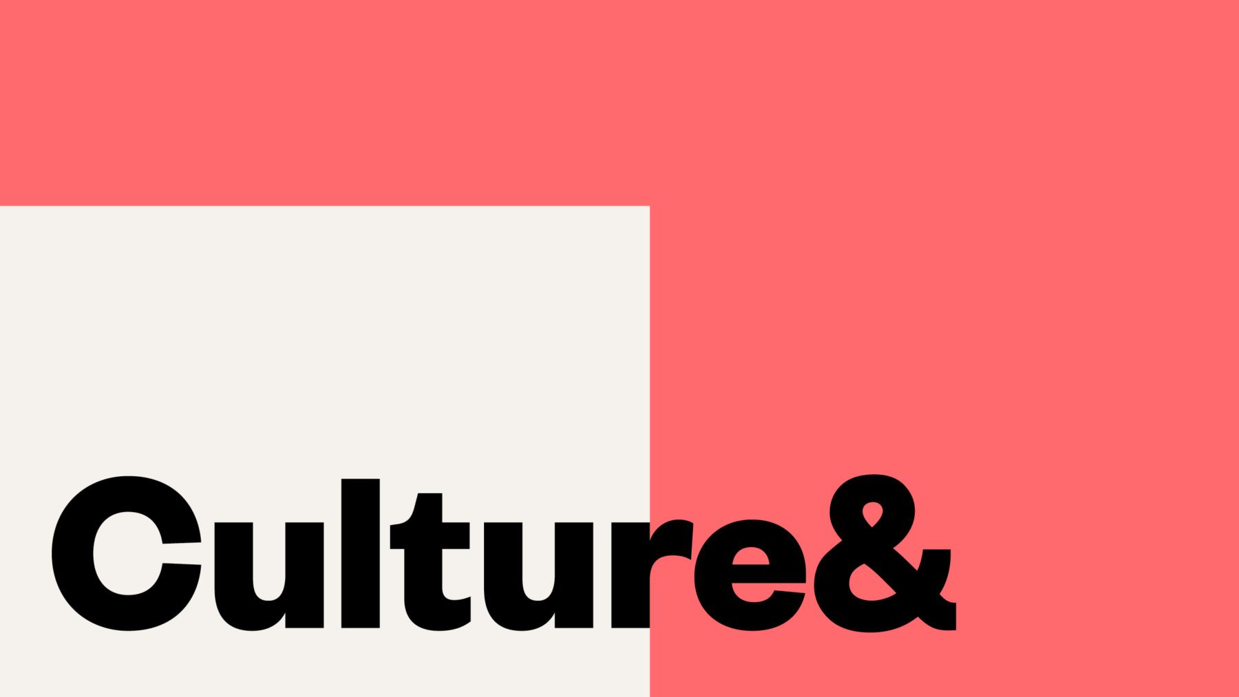
For the overall approach to Culture&’s brand, we focused on the idea of a rich tapestry. Culture& deals with many cultures and ideas through collaborations, juxtapositions — we wanted to celebrate this richness in the brand applications.

All communication materials are build on their imagery, colour blocks and their values, proudly displayed as a mantra, reinforcing what Culture& believes in. Visually, they communicate the convergence of many ideas, like a tapestry.

PLAY

Following the brand refresh in 2016, Culture& has since evolved and grown. The new Public Programme and the New Museum School, forming three separate entities which come together in a clear system defined by colour, so each can have its own recognisable colour. Each entity also has its own place on the website — all coming together in one unified identity which is clear and coherent.

The website displays adaptable shapes on the homepage, now as an interactive element that moves with the user. This can also be seen in the navigation which highlights each division with its own defined colour shade.